
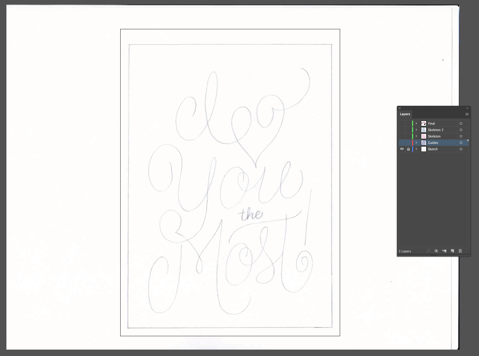
Last week I walked through the sketching process for this piece I did for Valentine's Day. Today I'm going to finish it up and show you the digital process. After scanning the final sketch, I bring it into Illustrator. I create a 5"x7" artboard and put the sketch on it's own layer, labeled "Sketch".
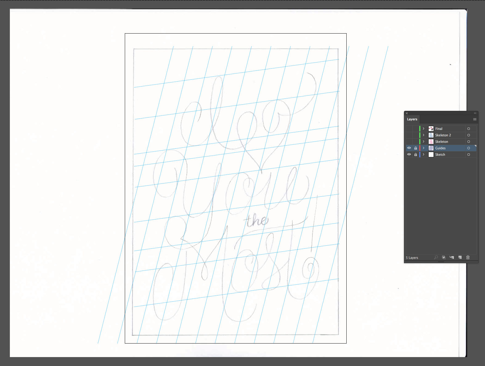
I create a new layer on top of the sketch layer labeled "Guides" and draw my guides on there. Any line that you draw in Illustrator can be made into a guide by right clicking when the line is selected and clicking "Make Guides". I use this all the time when created slanted guides. Time for another layer! I label this one "Skeleton".
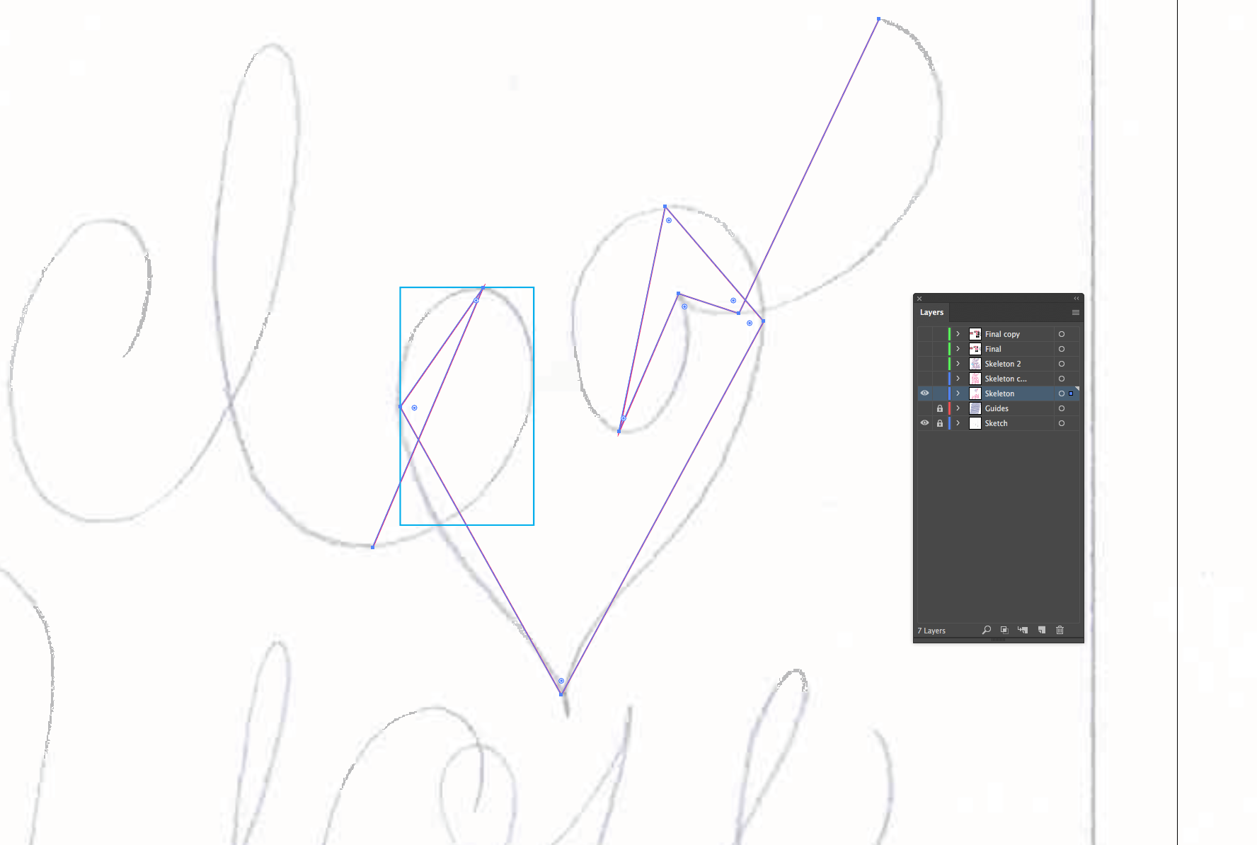
I start by plotting points at the extrema of each curve. Visualize a box being drawn around each curve and place the points where the box intersects with your curve. Sometimes I even draw a box (like in the picture above) to help me when a curve is being difficult. I try to place as few points as possible, you can always add more later.
Once the anchor points are placed, I use the anchor point tool to pull the anchor points out. Holding down the shift key constrains the angles of the handles. I try to keep the the handles completely horizontal or vertical whenever possible; if you can do that, you should end up with smoother curves and the minimum number of anchor points.
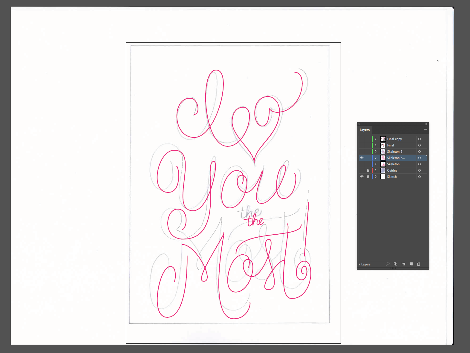
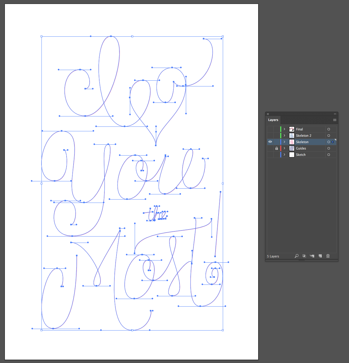
I left the sketch layer on here so you can see that already, the skeleton doesn't line up perfectly with the sketch. I've adjusted the spacing, used the guides to fix the slant of my letters and improved the curves so much that the sketch is becoming obselete.
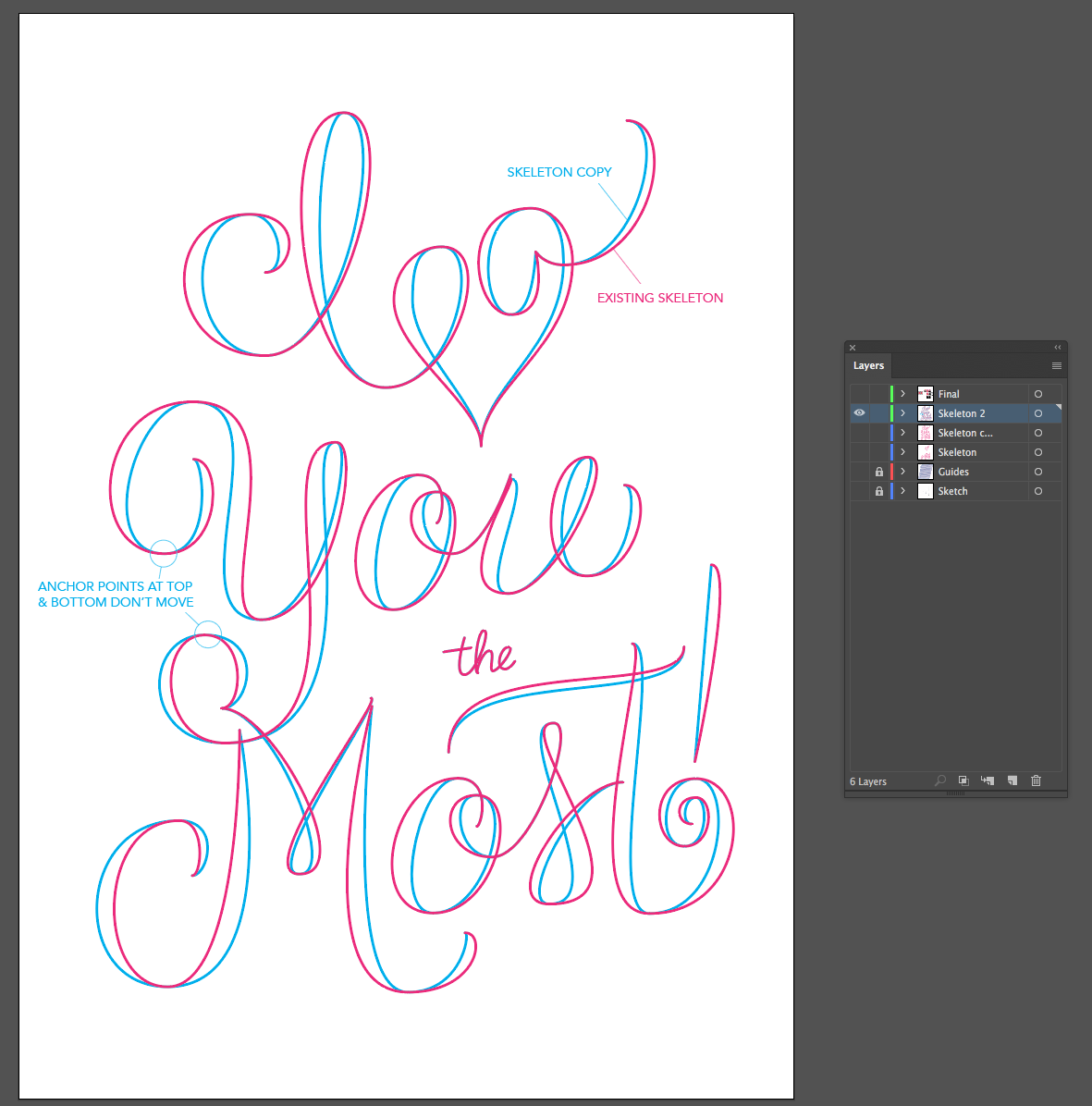
There are a few ways to add bulk to your letters and this is one that I really like for this calligraphic style. After my skeleton is in a really good place, I copy that layer (I love layers!). I then select the skeleton, copy it, lock it (cmd+2) and paste in place (cmd+shift+v). I make sure to change this copy to a different color so I can see what I'm doing. All anchor points at the end of flourishes, as well as those at the top and bottom of curves should stay where they are. I only want to add width to the letters.
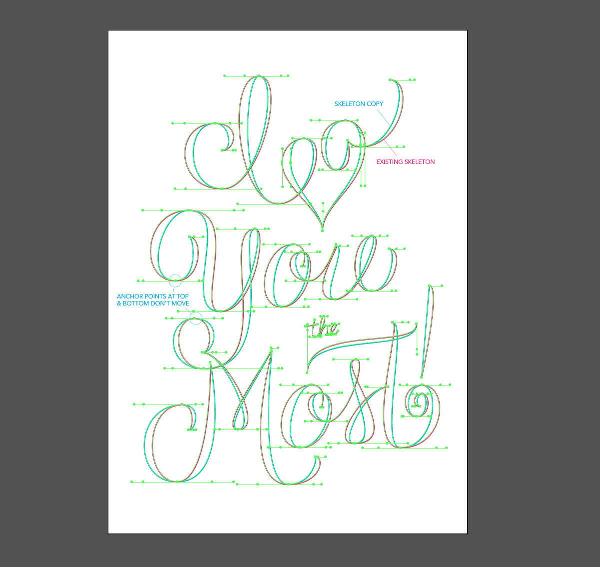
I do this by selecting the handles of the anchor points that aren't moving and draw them out farther. For those curves that have anchor points on the right/left of the curve, I use the direct selection arrow to completely move those points out.
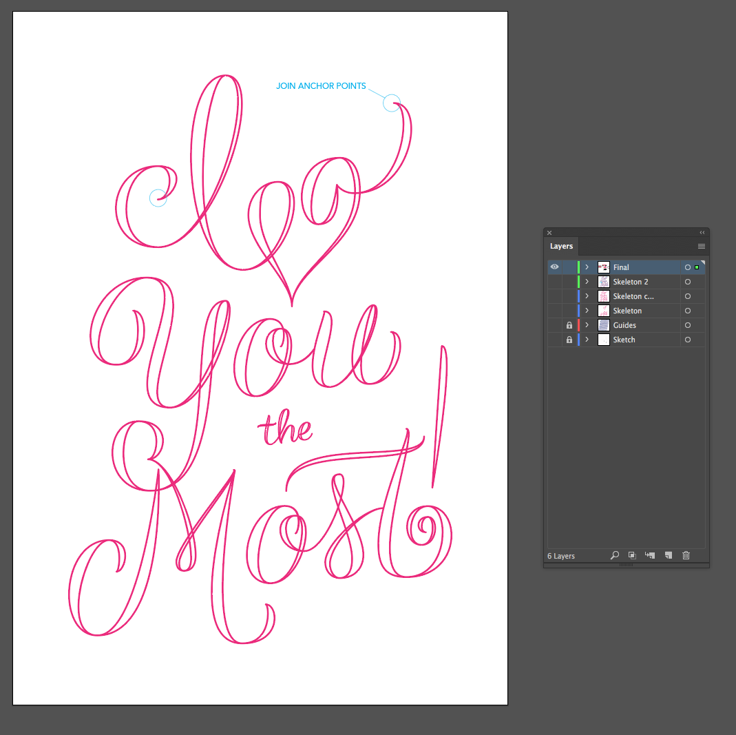
Once I'm liking how things look, I join (cmd+j) the anchor points at the beginning and end of each stroke which makes them a shape that can be filled in.
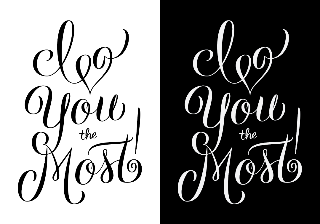
I fill in my lettering with black and also create an inverted version so I can get a better feel for the negative space. At this point I often print it out so I can look at it off screen, post it on Dribbble for feedback and in this case, I also posted it on Instagram for feedback. As much as I loved the "I" and the heart connecting, I was worried that it was making it unreadable, and based off of the comments I received, I was right!

After detaching the I and the heart, I also made the flourish in the "I" smaller as some people thought it was a "D". Add some color and we're done!
I hope this was helpful! I've never done a video while I'm working, but I think that might be helpful/interesting as well.